Samsung Galaxy Care
Process
Problems and Challenges
The original Samsung Care app consisted of multiple different sections, and subsequent updates did not maintain a unified visual language. This resulted in a lack of consistent visual language and operational logic between different sections and functions, making it difficult for users to find the needed devices and functions within the app. Specific challenges include a chaotic information display structure, making navigation difficult; a disjointed visual design lacking coherence and brand consistency; and a poor user experience, with a cumbersome and non-intuitive usage process.
Solution
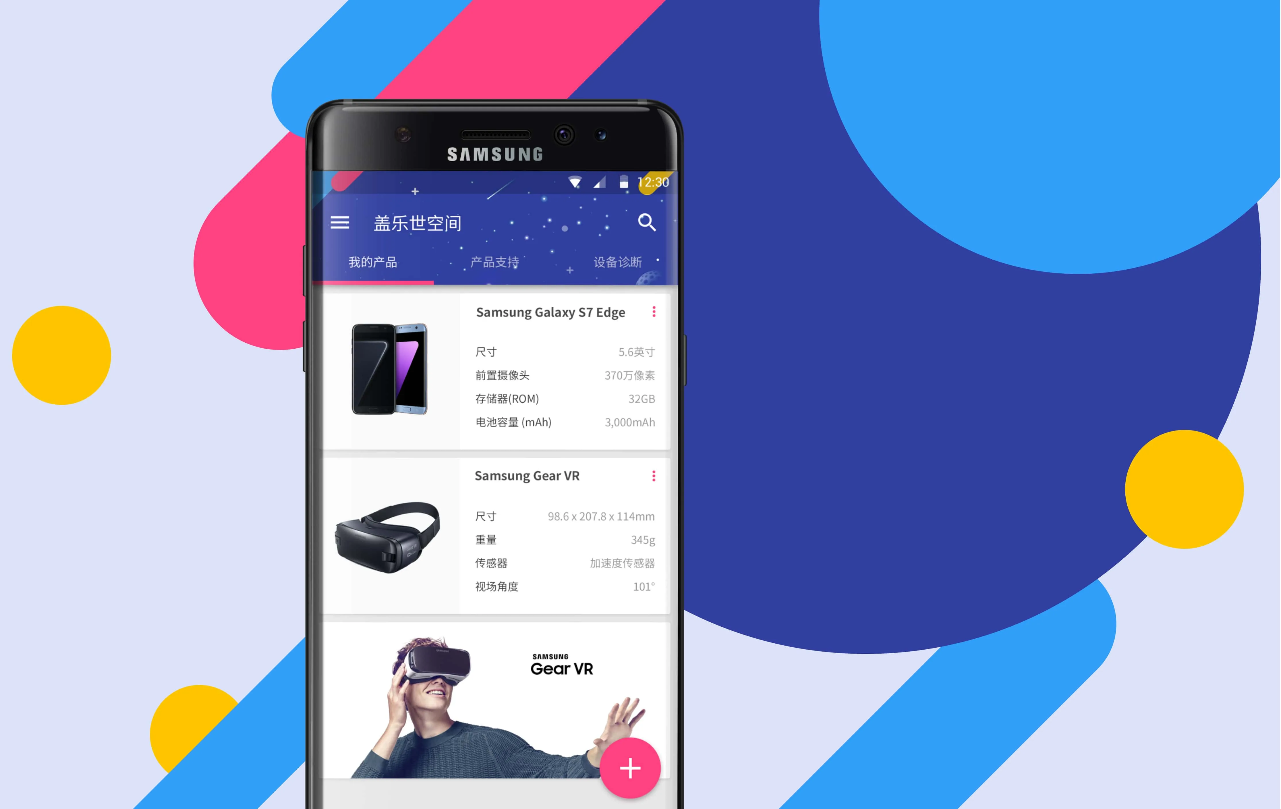
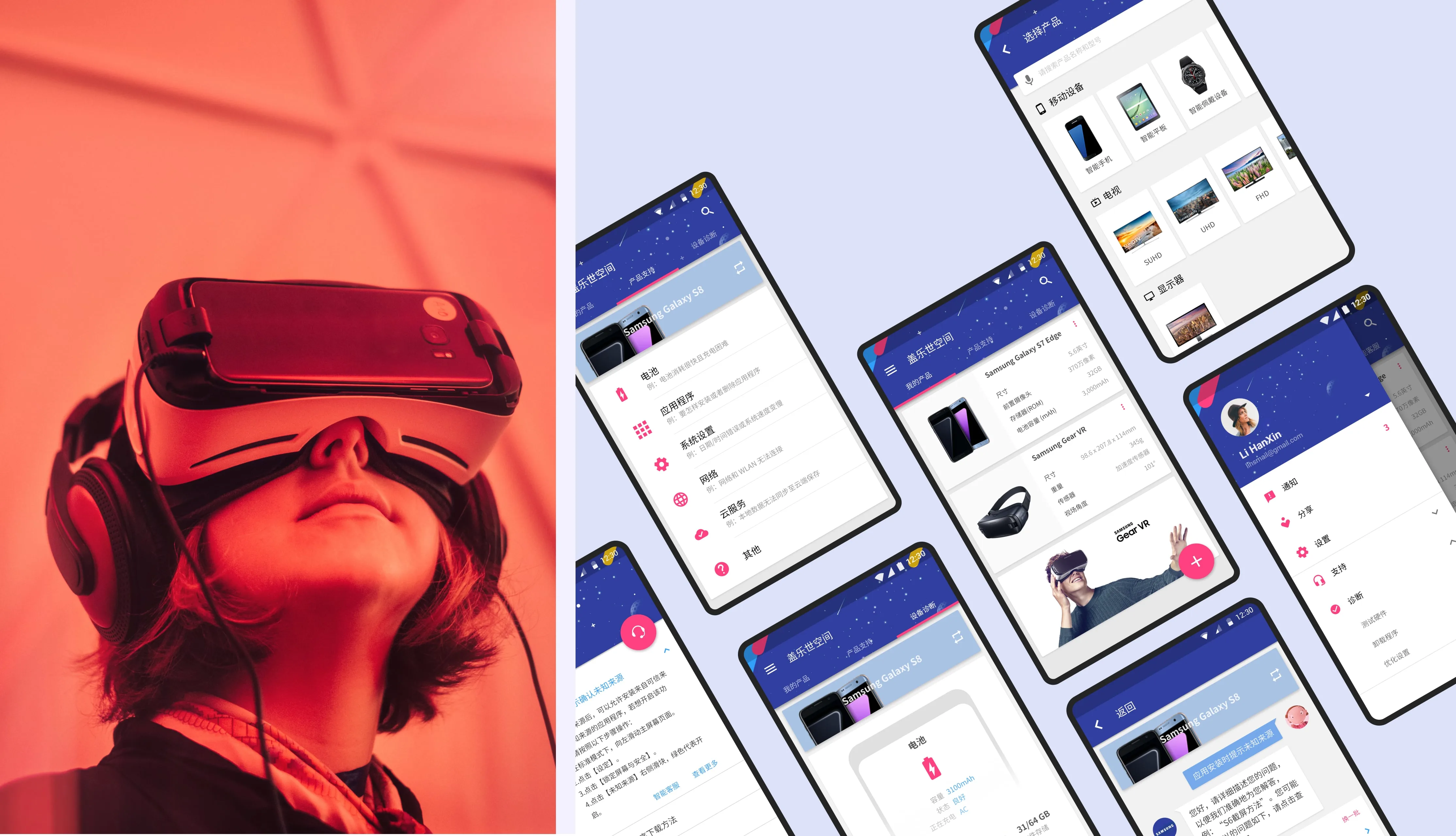
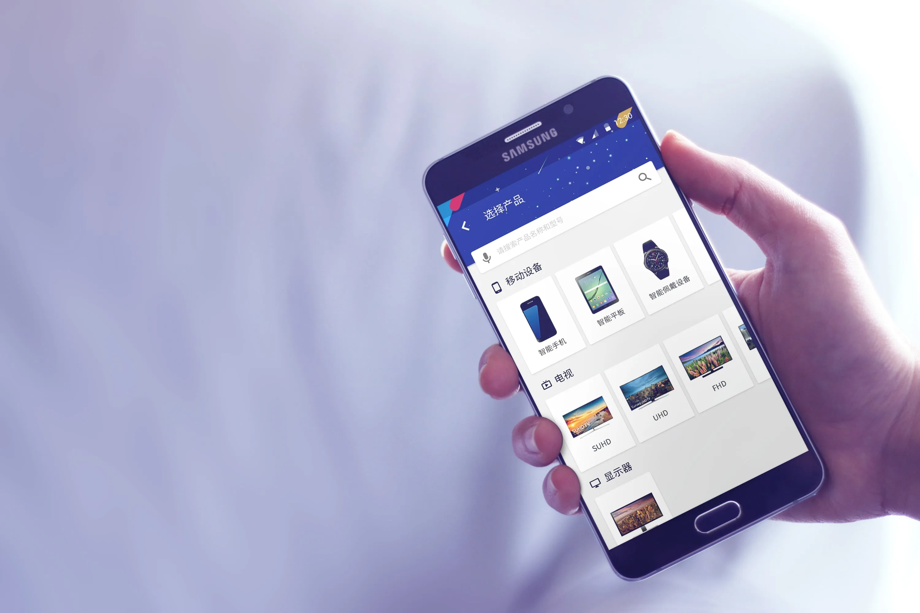
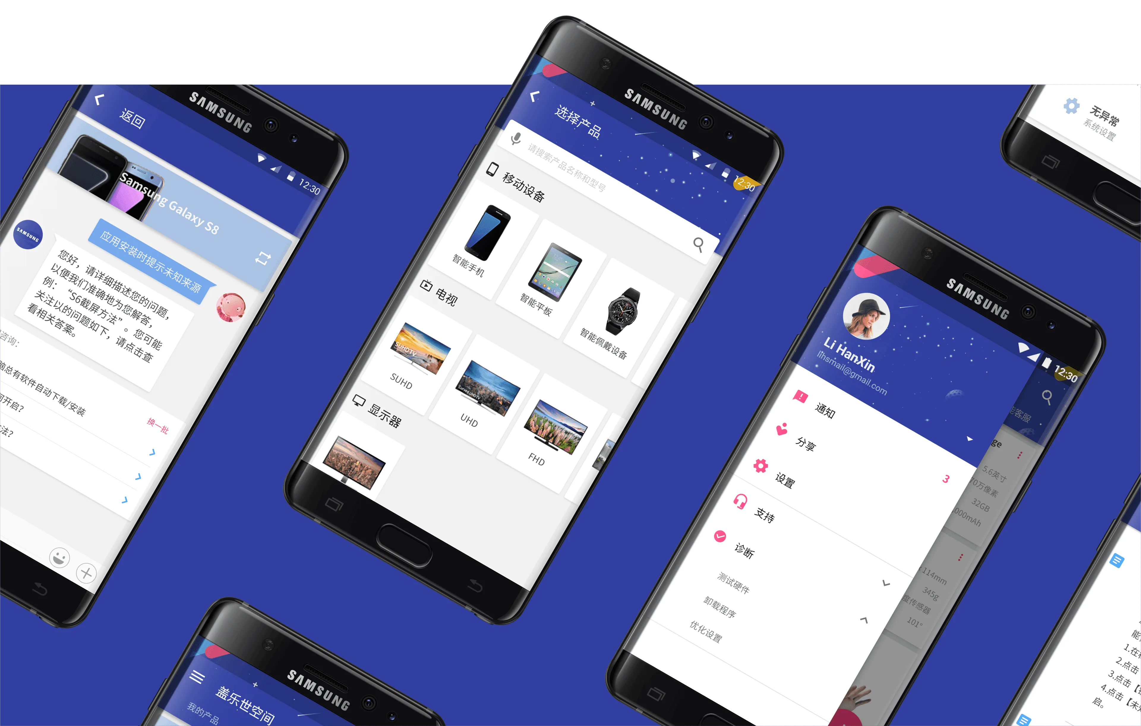
We reorganized the information display structure and unified the visual language by applying Google’s Material Design guidelines. This ensured visual consistency across all sections and functions, enhancing the overall aesthetics and brand recognition. Additionally, we optimized the navigation structure, simplified information hierarchies and processes, allowing users to find the needed functions and information more quickly and intuitively. Through more intuitive interaction design and clear function guidance, we reduced the number of user operations, improving ease of use and user satisfaction.
Outcome