Ford Internal Magazine
Process
Problems and Challenges
The main challenge of the project is the tight deadline, as we need to complete the entire design process within two weeks. Since this is a completely new app, we must communicate thoroughly with the client in a short period to understand their specific needs, ensure the design solution fully meets user requirements, and achieve the client’s expectations in terms of both visuals and functionality.
Solution
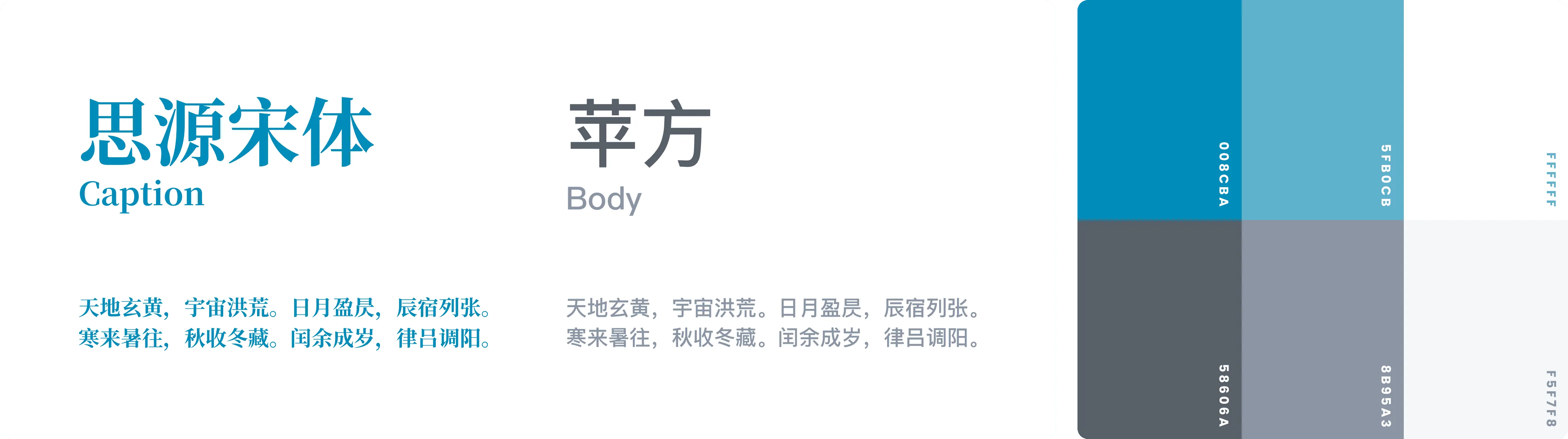
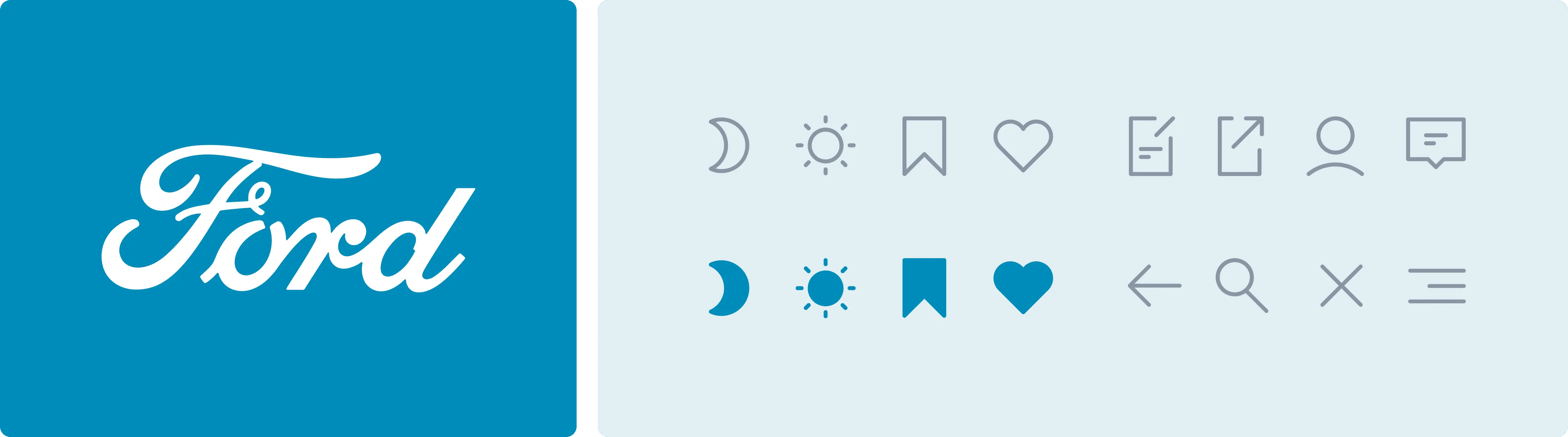
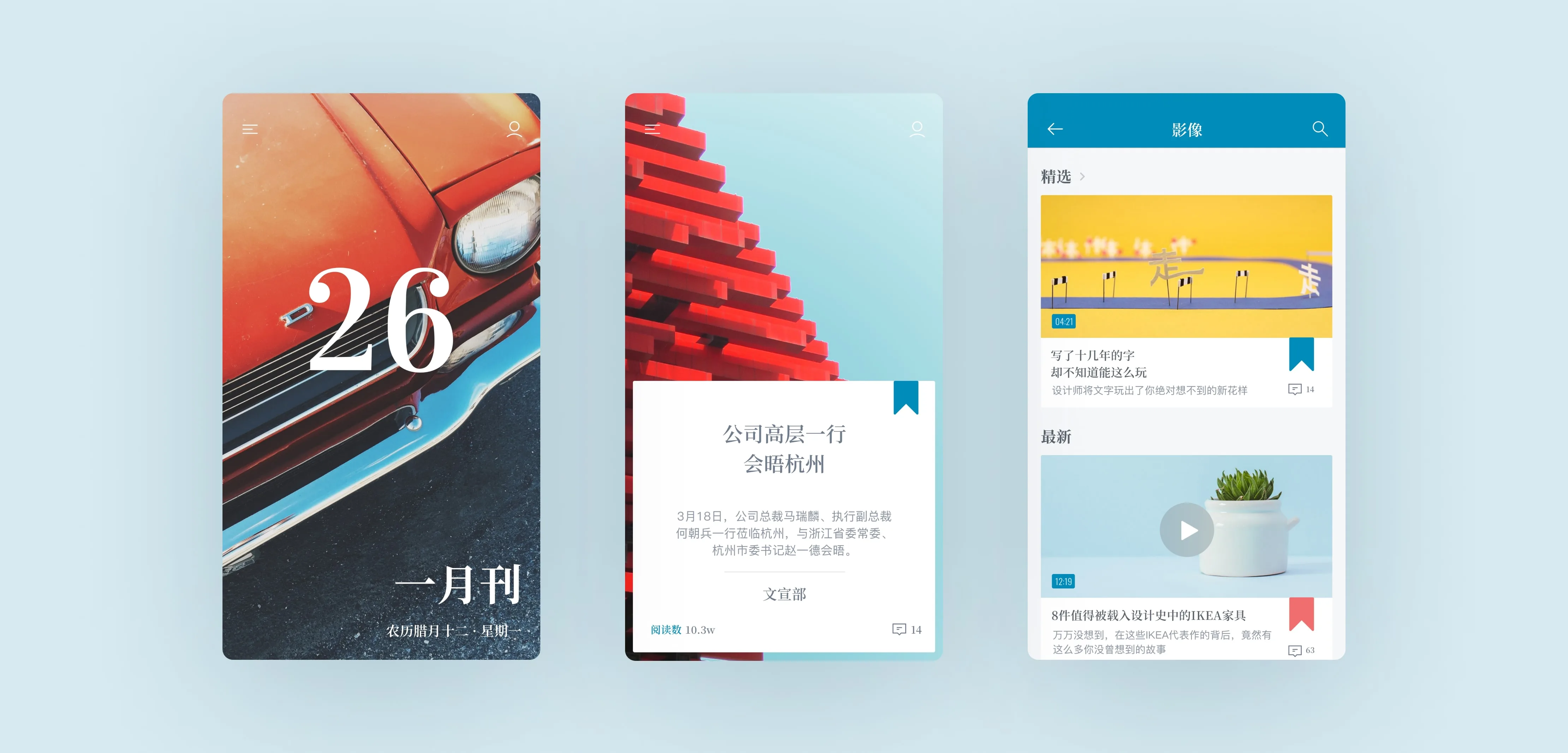
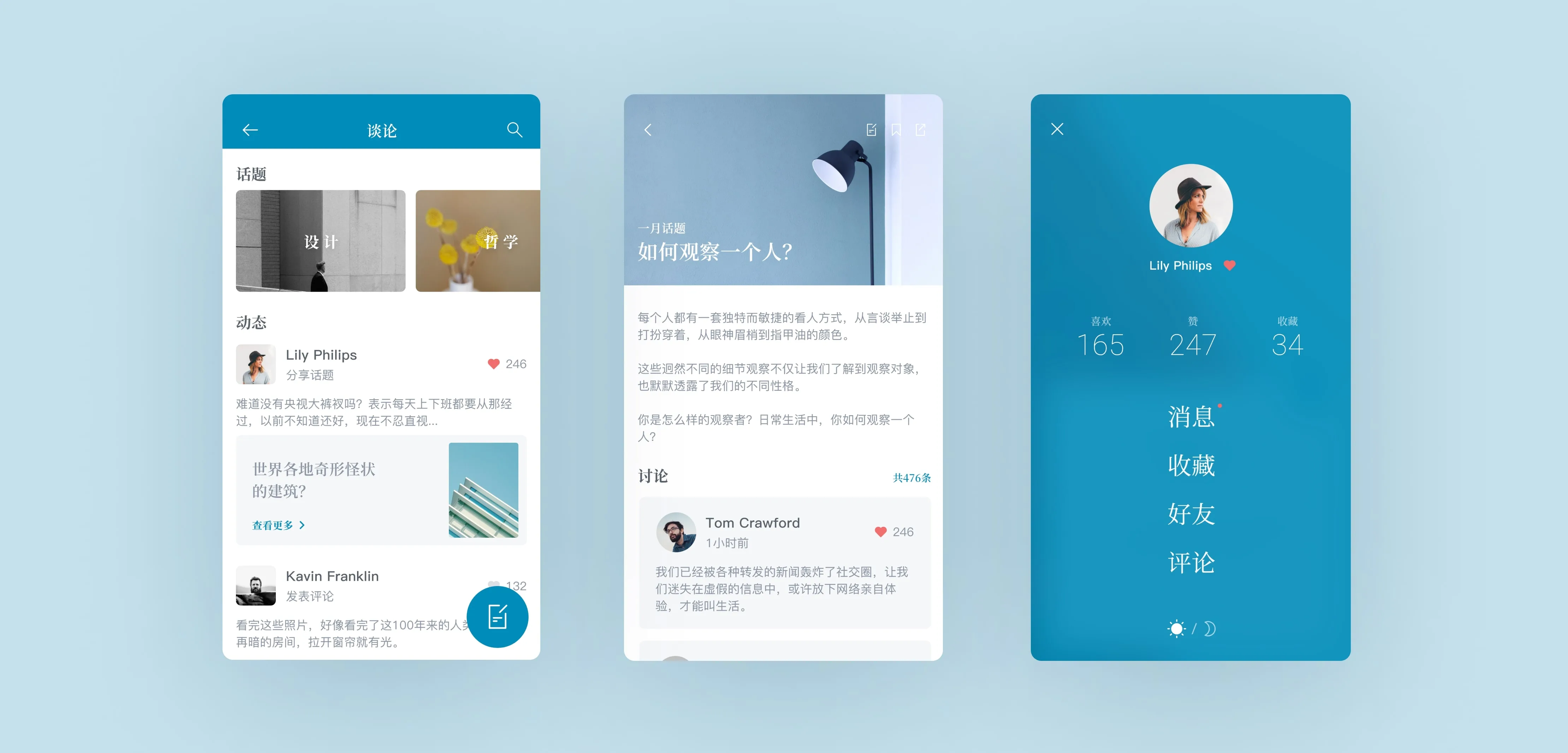
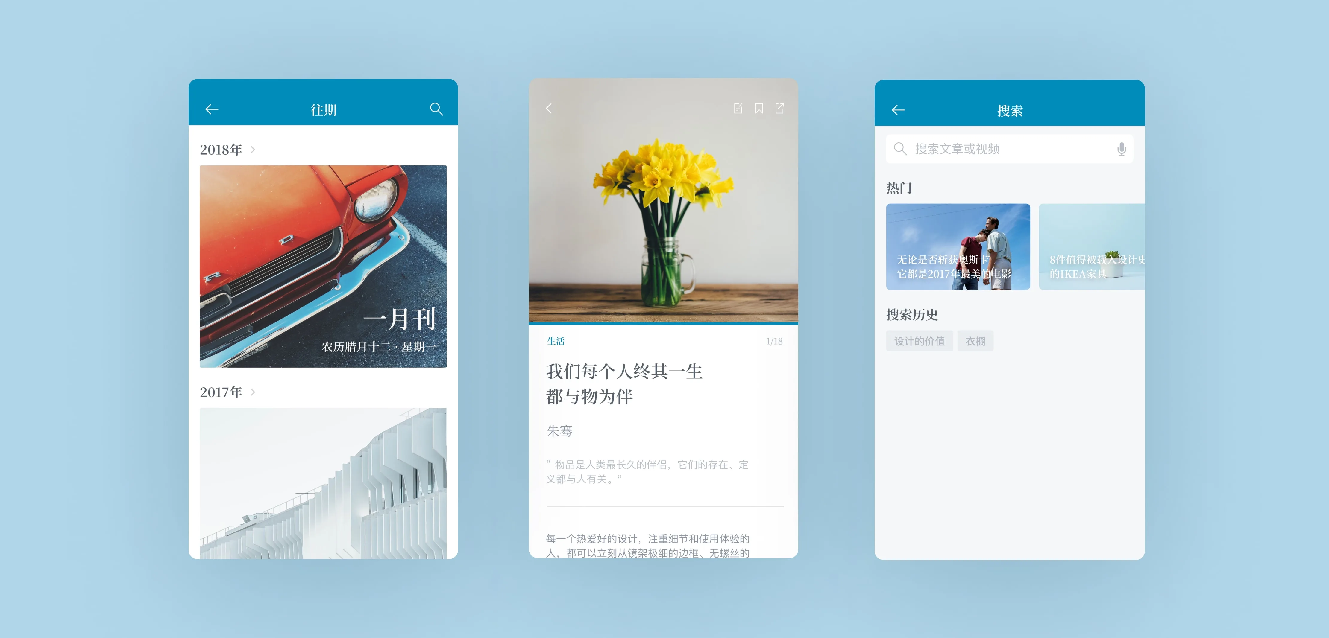
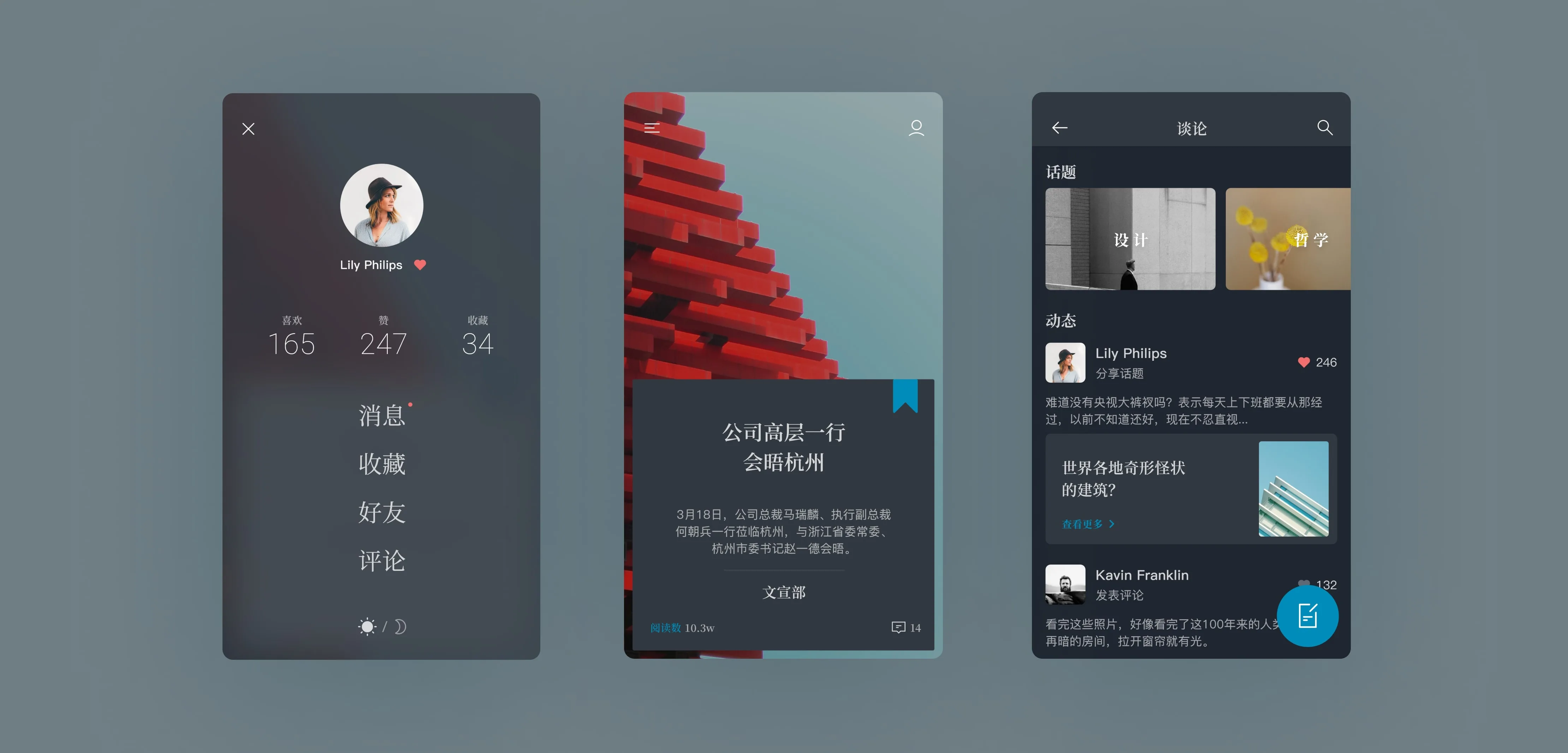
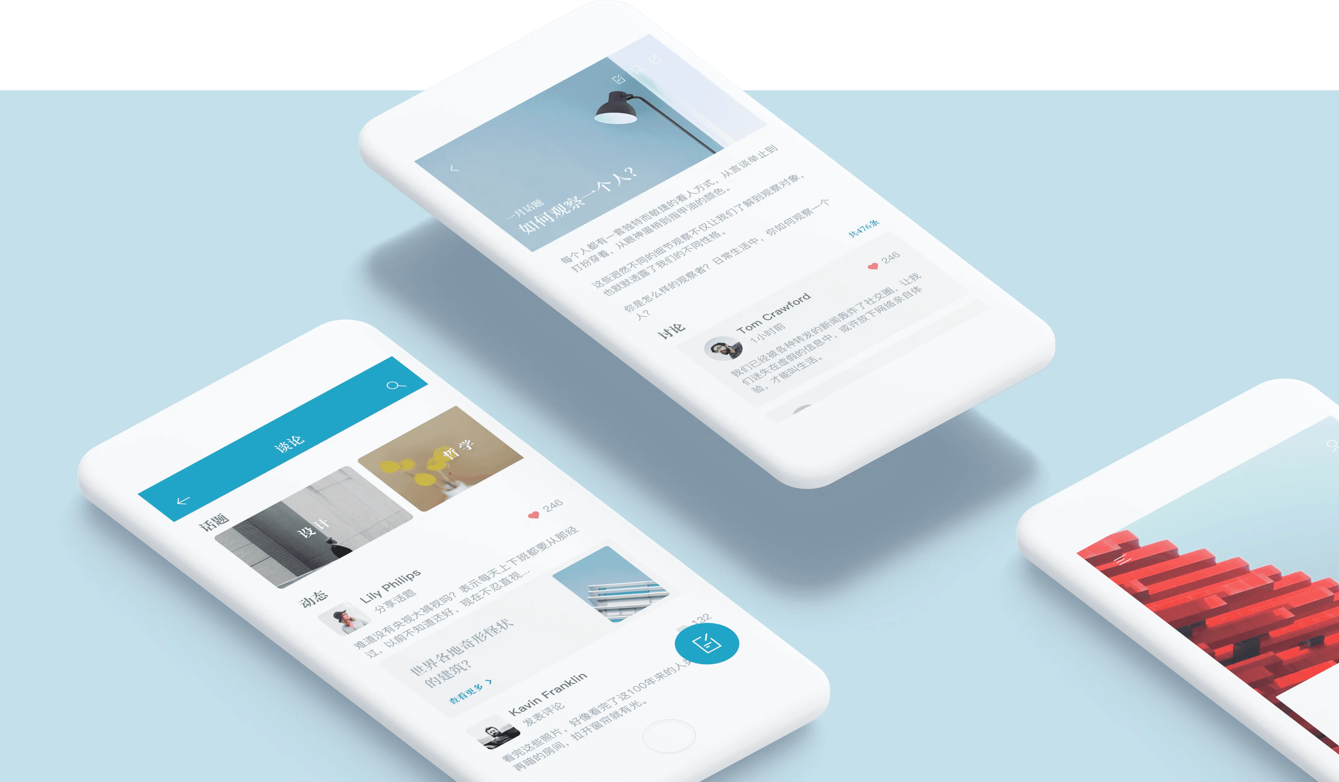
We decided to design the app by incorporating the reading characteristics of traditional journals, focusing on user habits and using swipe page-turning as the primary interaction method to closely match natural operation habits. This design allows us to remove the bottom tab bar to expand the content viewing area, achieving a more immersive visual experience. The app adopts Ford’s signature blue color, adjusting its saturation to create a soft and comfortable color scheme to support long-term reading. To match the overall visual style, we created a set of simple linear icons and used two different fonts, with a serif font for titles to enhance the app’s traditional journal feel. The overall design aims to provide users with the texture of a physical publication and a comfortable reading experience.
Outcome