Up Finance
Process
Goal
The goal of Up Finance was not to design another crypto payment product, but to build a clear, reliable, and long-term digital finance brand. It needed to communicate asset security, cross-border mobility, instant exchange, and everyday spending, while giving users a sense of stability and control similar to a private banking experience.
Insight
Crypto finance is often associated with complexity, volatility, and uncertainty. Because of this, the brand identity could not rely only on a futuristic Web3 aesthetic. It also needed the structure, compliance, and trust expected from a financial brand. The design had to balance digital innovation with asset credibility — expressing the liquidity of crypto assets while reassuring users that the platform is secure, professional, and dependable.
Concept
The visual concept was inspired by movement, connection, switching, and flow.
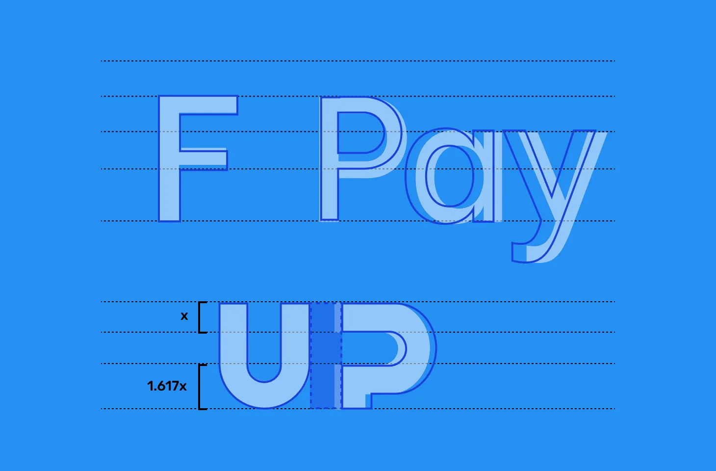
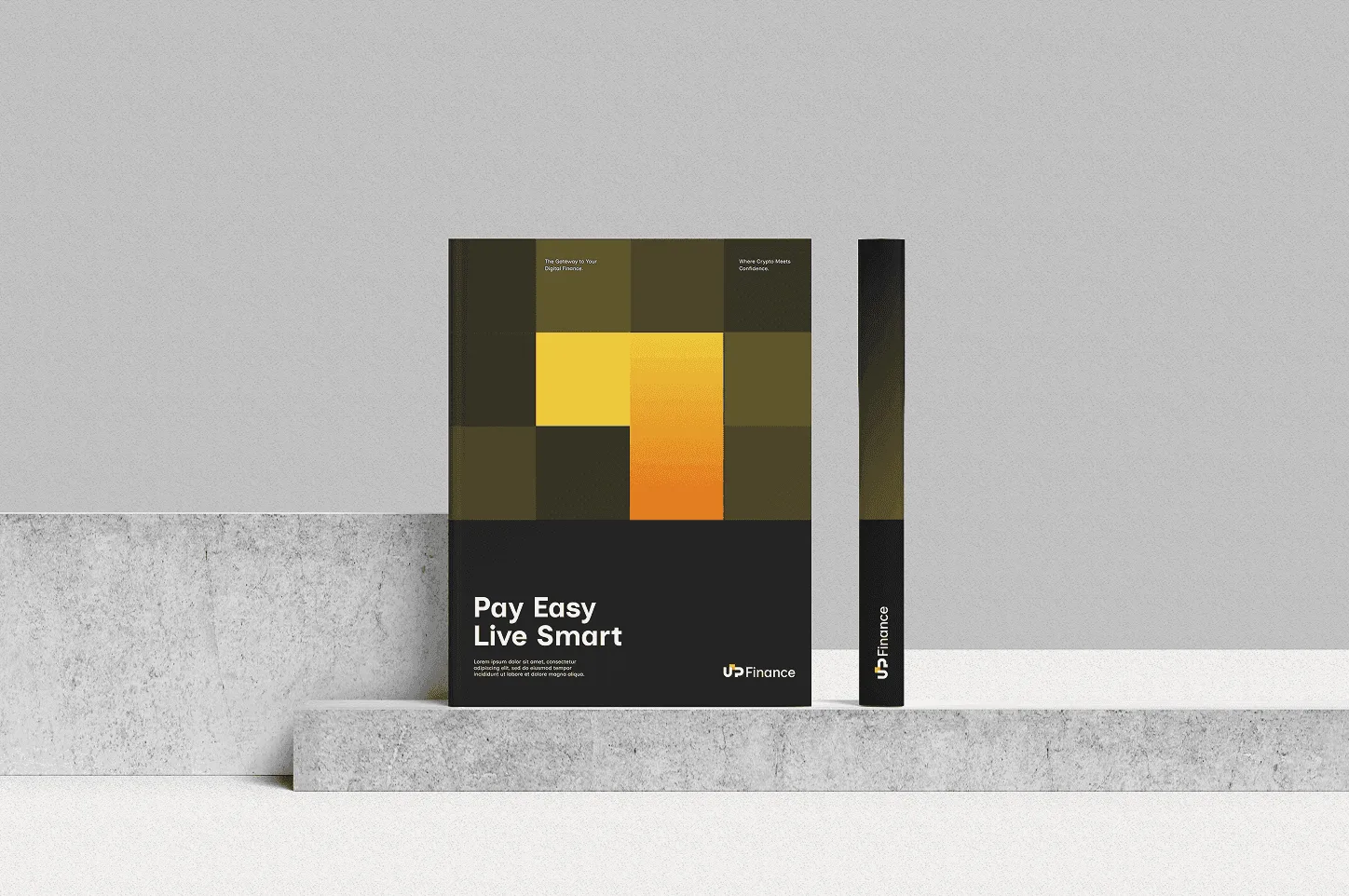
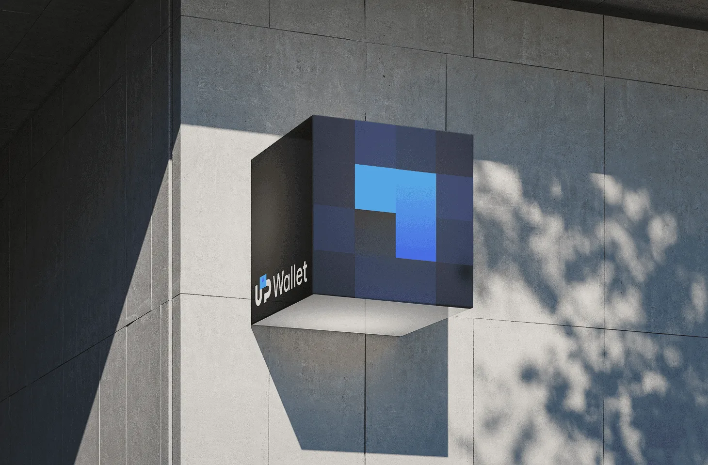
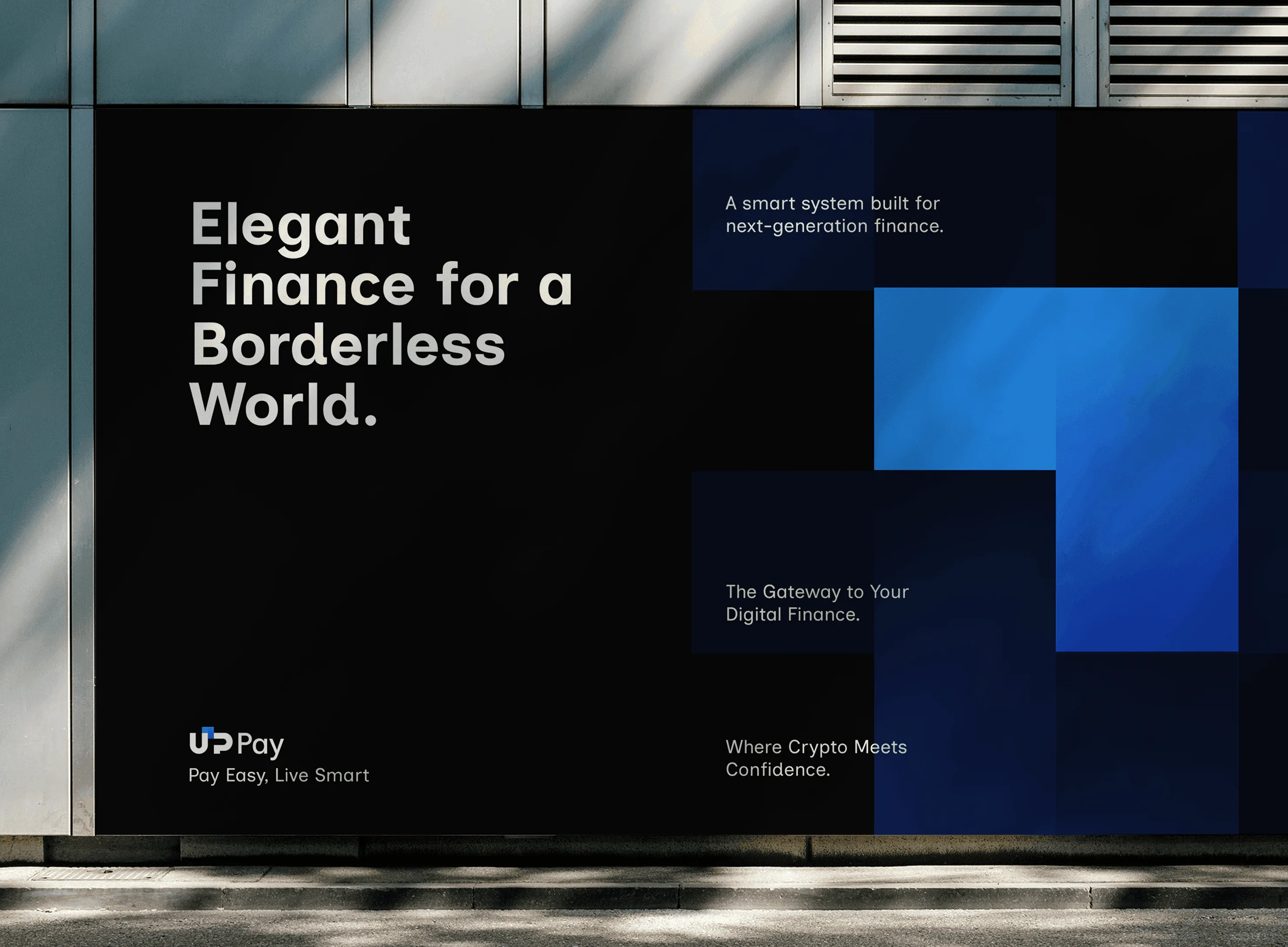
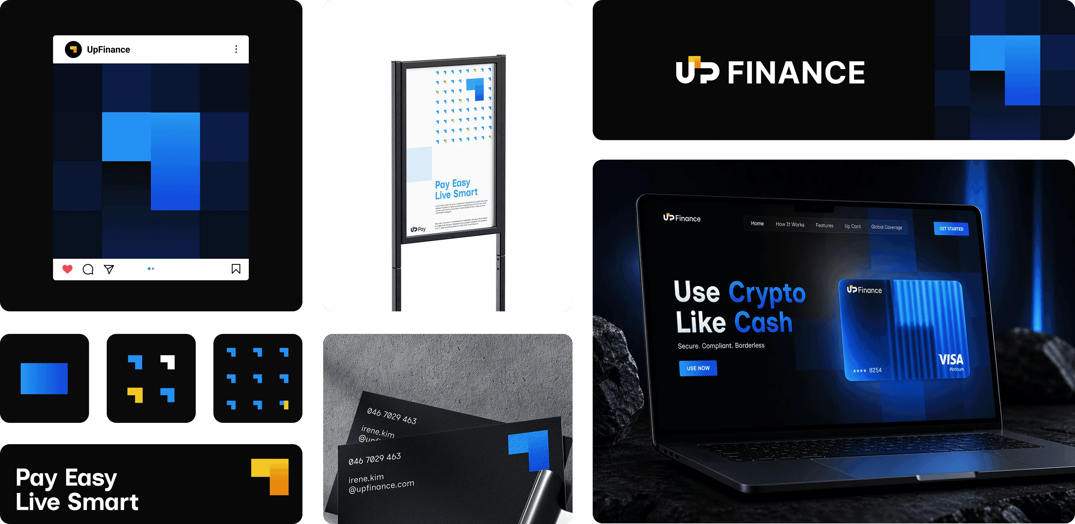
I used a raster-like matrix as a metaphor for blockchain structures and cross-border exchange systems: a precise container that supports the movement and conversion of assets across different financial scenarios. The embedded arrow represents the user’s original assets entering the system, as well as a clear path from asset management to exchange and payment.
Design Solution
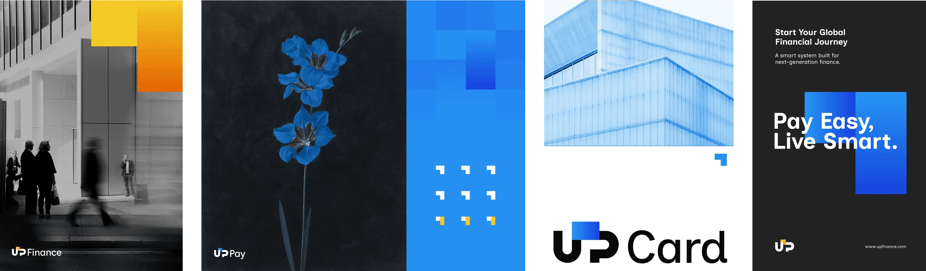
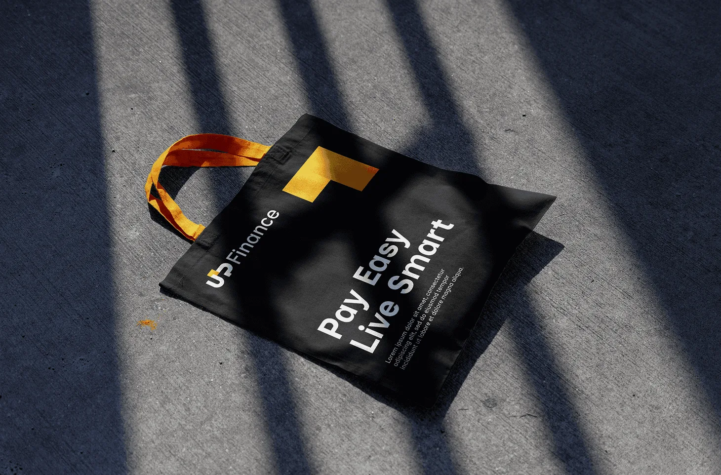
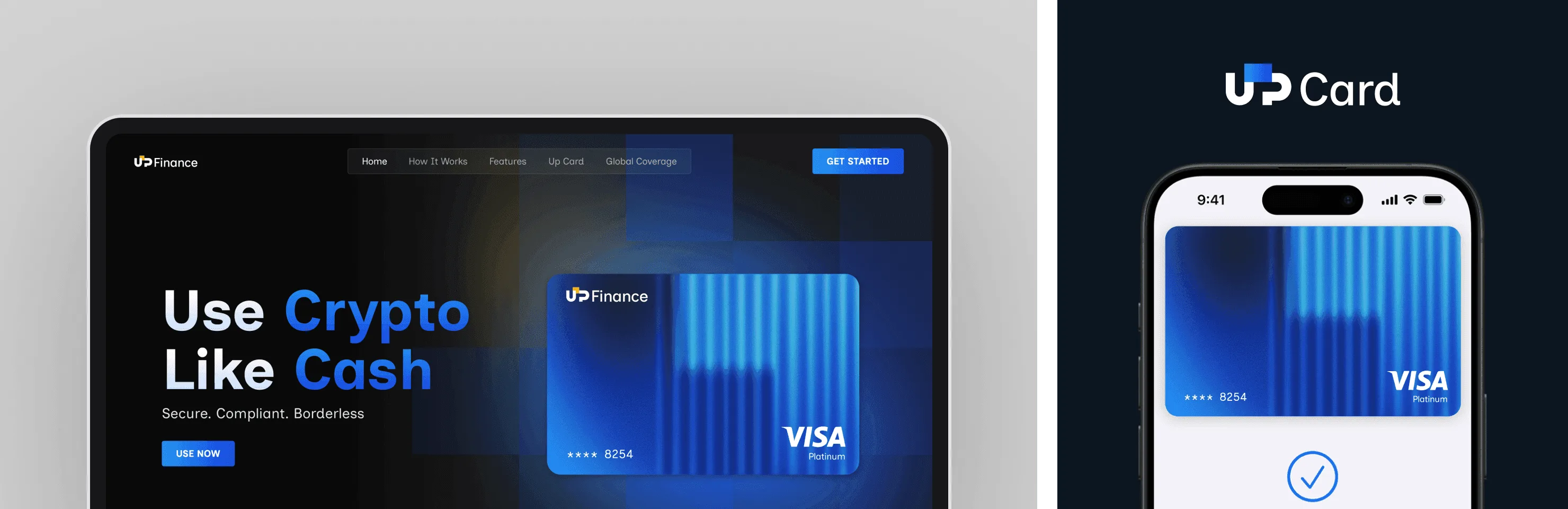
The brand system is built around arrows and square modules as its core visual language. The yellow arrow inherits the visual equity of the previous brand, preserving recognition, while blue introduces a calmer and more trustworthy sense of digital finance. Through the combination of simple geometric elements, Up Finance establishes a clean, ordered, and scalable visual system, which is then extended across the logo, VI system, payment cards, and website. Together, these elements form a complete brand experience — from asset input to digital value transformation.
Outcome