Hanvon
Process
Visual Design
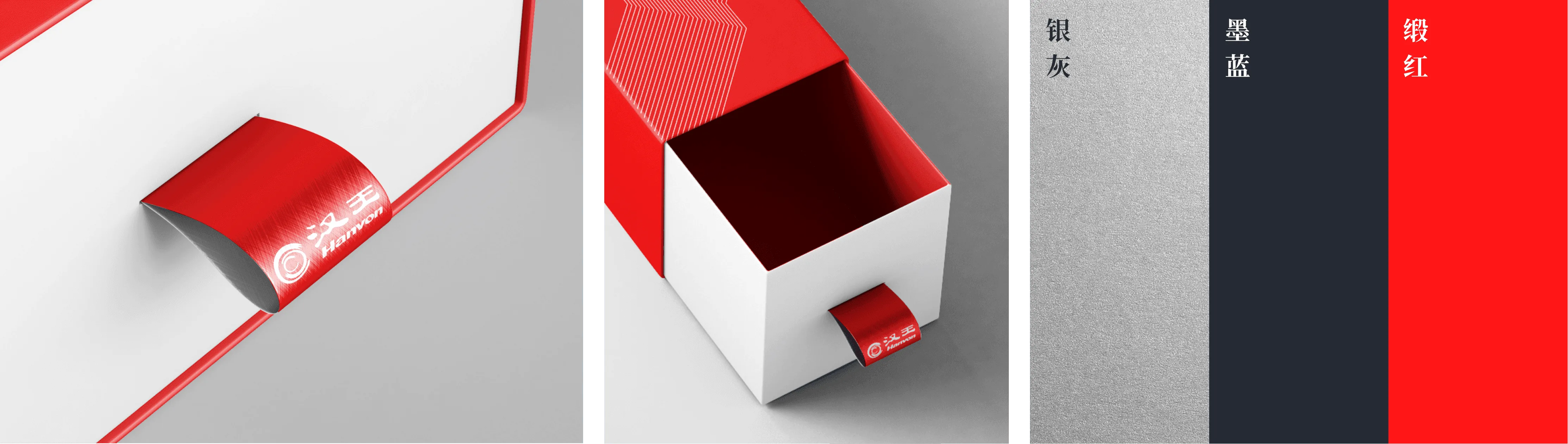
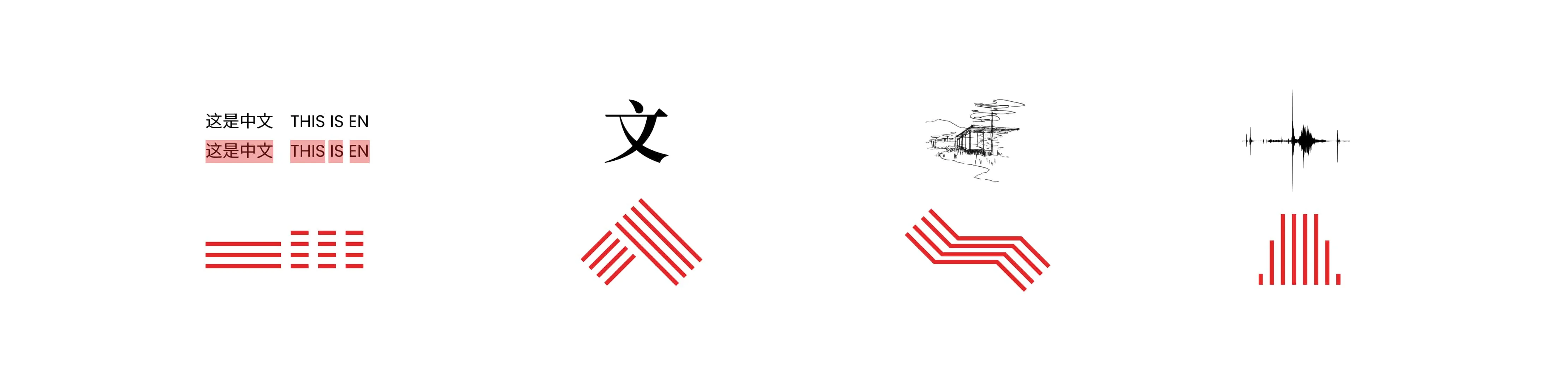
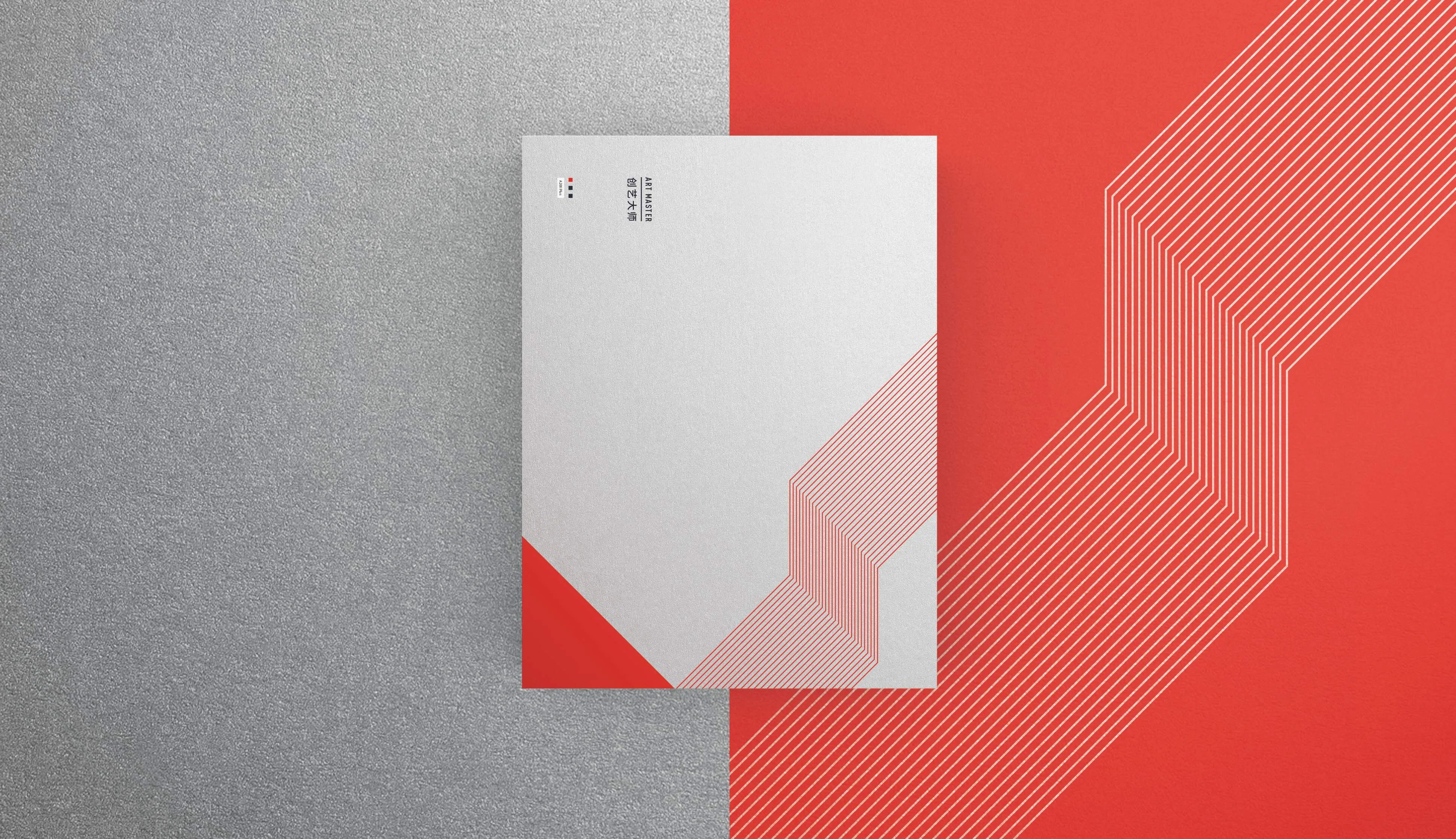
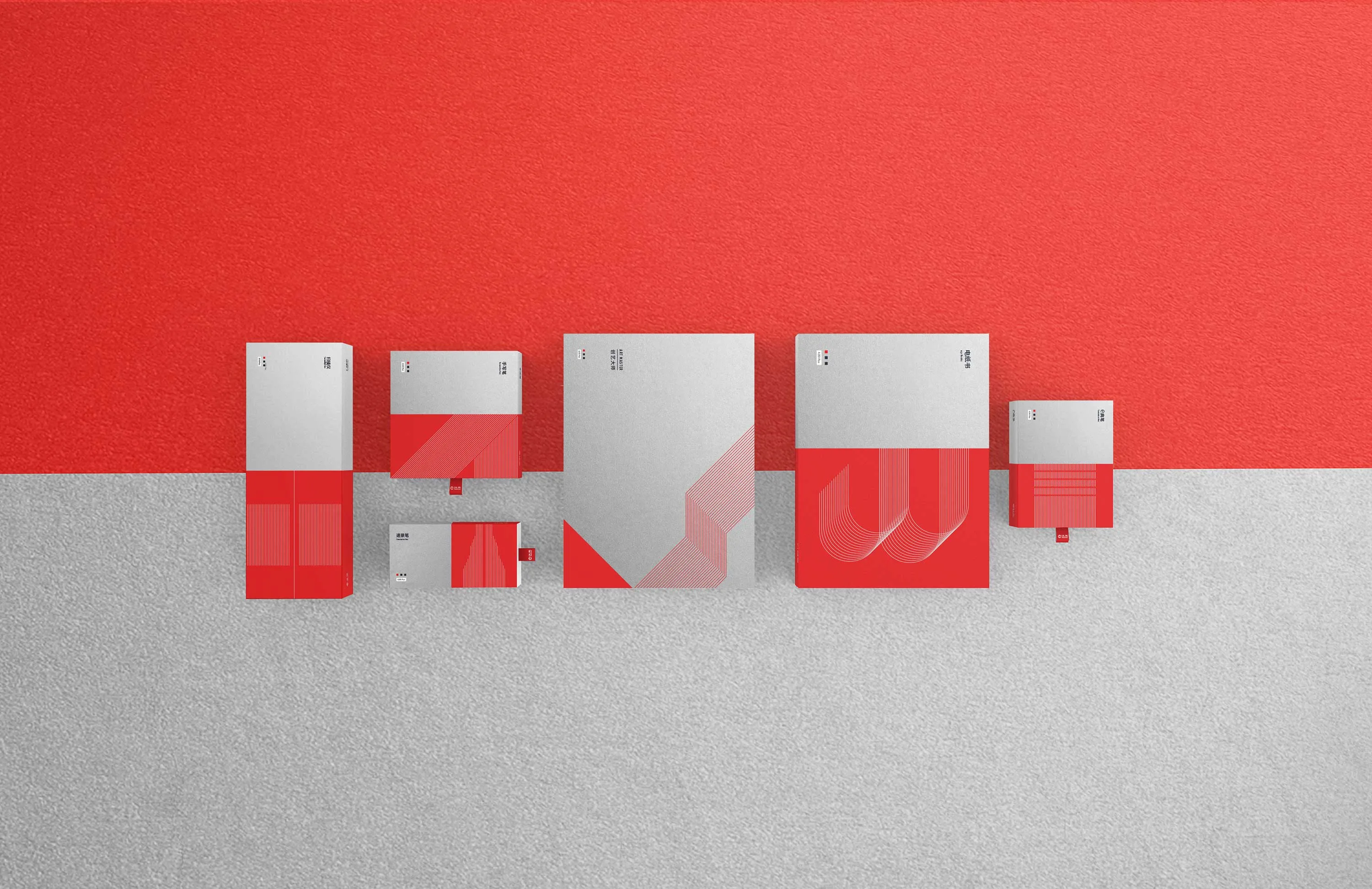
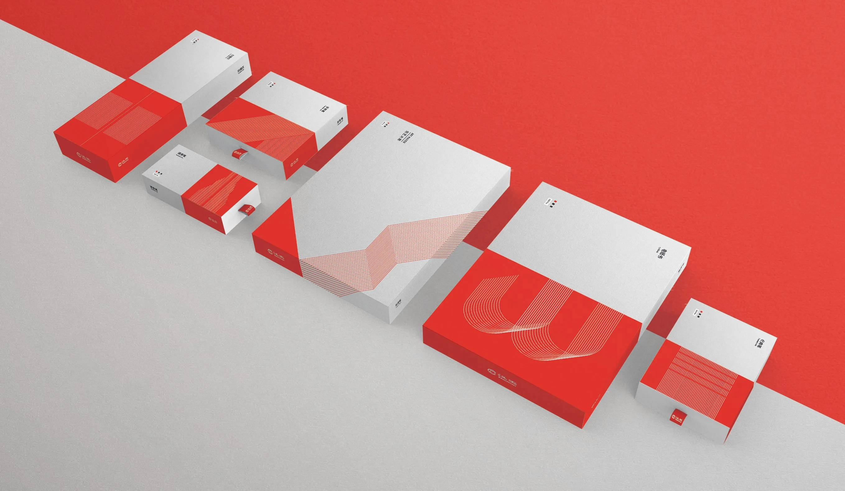
Inspired by impressions of technological objects, the design constructs a technological and professional imagery through the distinction of color blocks, variations in lines, and the use of materials. Abstract line graphics encourage imagination, mirroring the intangible connection formed with the product during use. Red is Hanvon’s standard color, conveying strong emotions and cultural symbols with high impact, making it one of the primary colors used in packaging. Blue, known for its calmness, is often the representative color for tech companies and related products. By adding gray to the standard blue, we created a dark blue color that conveys a sense of depth and stability, aligning with the sophisticated image of a “pen” and symbolizing the intrinsic quality of the products.
Packaging Design
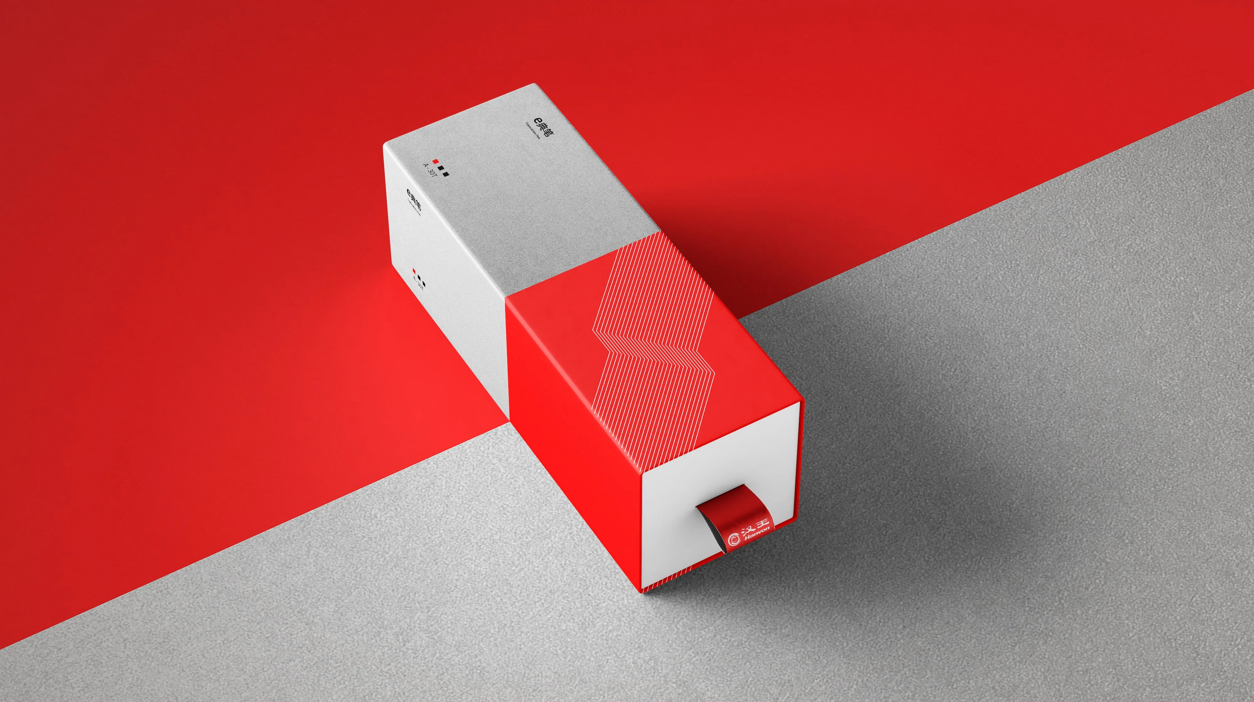
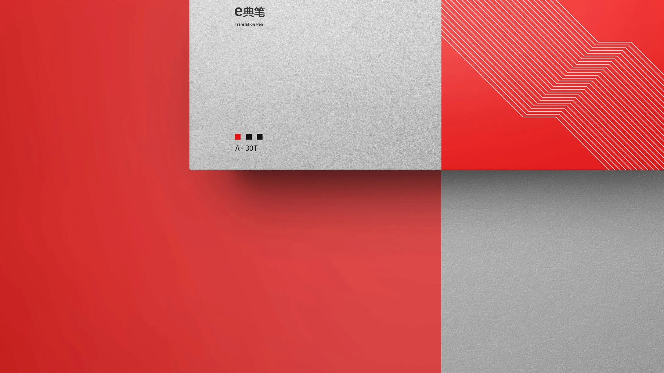
The pull-out packaging design gives a refined impression. The red pull-out tag not only emphasizes the Hanvon brand but also becomes a signature element. Silver stamping on the white spaces and patterns enhances the texture. All product packaging sizes are standardized and cut proportionally, allowing the hard cardboard boxes to pack products of different sizes and volumes. Fixed text information is printed on the box body, enabling the same packaging format to be used across a series of products. Specification information and after-sales codes for different products are attached as labels, suitable for various sizes and styles of packaging.
Outcome